Archive for the ‘INTERPRETATION’ Category

graphic design

March 7, 2008

deconstruction-resize.jpg

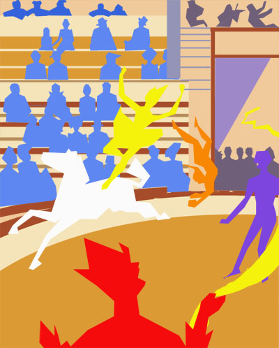
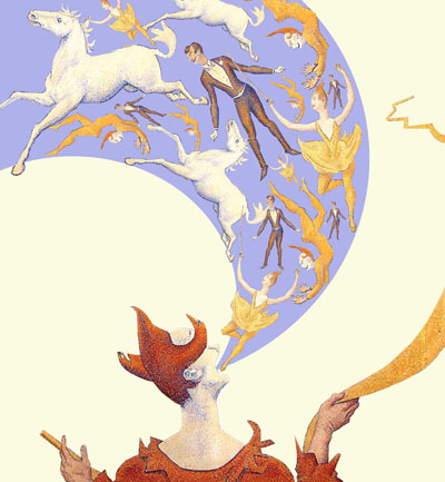
By cropping out the outline of the performers, I reconstructed the original image and rearranged the characters in a graphical rather than in a realistic manner. A visually literate viewer would almost automatically interpret this analogically rather than in a straightforward manner. This style can also be easily adapted to a poster or graphic design.

Looking at a negative print (almost)

February 29, 2008

circus-invert-16-resize.jpg

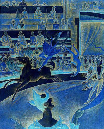
In this image, the tones are inverted… i.e. the light colours in the original image is now dark in this image and vice versa. It feels as if we are looking at a negative, but not quite because of its limited range of colours and tints.

Looking on at this image evokes a very cold, unreal and surrealistic feel.

Scanner vs Photocopier

February 22, 2008

circus-2-resize.jpg

circus-3-resize.jpg

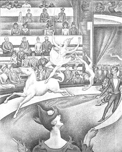
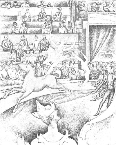
Indeed, the technology we use to create the final image affects how we view and value an image. The top image is scanned directly in grey tones and the bottom is created by photostating. There is a marked difference in the two images. All else being equal, if these two images are printed out on the same kind of paper, the ‘scanned’ one would look like it is of a better quality than the ‘photocopied’ one because the scanner is better able to discern tones than a photocopier.

Hence, the better quality print would be better valued than the photocopied print.

How would Matisse have interpreted THE CIRCUS?

January 18, 2008

circus-graphic-resize.jpg

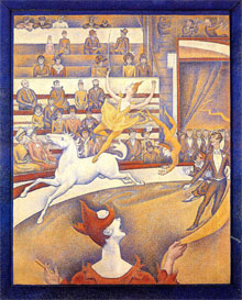
If Matisse were to re-interpret Seurat’s The Circus, how would he have done it?

Matisse was considered one of the greatest colourist of the 20th century. He was fond of using bright and expressive colours. His paintings during his Fauvist years are characterized by dramatically simplified areas of pure color, flat shape, and strong pattern. Towards the last few years of his life, even as he was too weak to paint, he created papercuts, carving and scissoring out coloured paper into shapes, and collaging them into sometimes vast pictures.

Maybe he would have done it as above… 🙂

Works of art on various products

January 11, 2008
An image may have its own effects, but these are always mediated by the many and various uses to which it is put. (Rose, 2002, p 14)

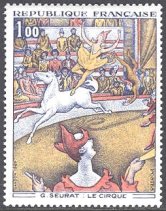
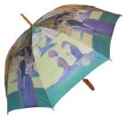
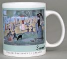
With increasing commercialisation, reproductions of art works are common and these may be reproduced on many products and souvenirs by various organisations. Examples abound, such as umbrellas and mugs by museums, stamps by the state and images of art works on even T-shirts, coasters, paper plates and cups, balls and toys by enterprising companies. Below are examples of some products that have art works reproduced on them.

circus-stamp-27.jpg  2807855969.jpg 

182188836.jpg  71035301.jpg 

How does this affect the way the image is viewed?

Well, in my opinion, it depends on what product it is imprinted on, the purpose tthe image serve on product and who produces and distributes the product…

A work of art printed on a stamp would be seen as an honour, while a poorly reproduced image on a ball for children to play would seem to ‘cheapen’ the work of art.

FRAMES MATTER!

January 4, 2008

frame-1.jpg  frame3.jpg

frame-2.jpg  Just another thought…

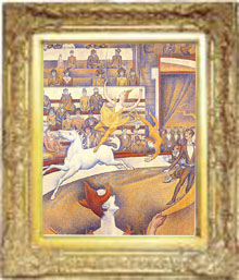
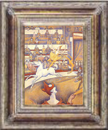
The type of frames, the  design of the frame, the materials that the frame is made out of (wood, plastic etc..) and the colour also play an important role in the viewers’ engagement with the image…

The original masterpiece in solid timber frame would probably be taken more seriously and generate more interest and discussion than a print in a plastic frame. The type of frames gives a subtle cue to the value of the image.

CROPPING 2

December 31, 2007

Having fun with all the Adobe Photoshop tools… 🙂

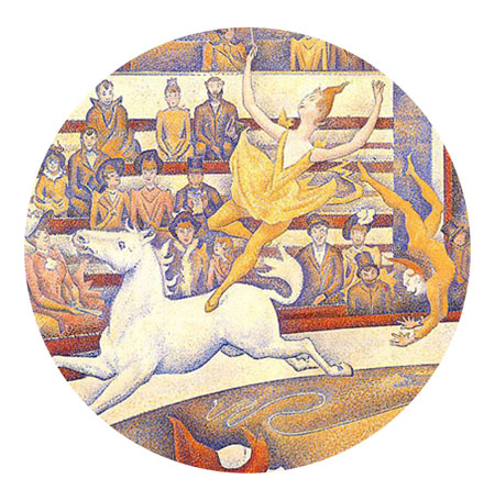
Just exploring the effects of using a circular frame instead of a rectangular frame… The circular frame brings the level of interest in the image another level. Because we commonly see images placed in a rectangular frame, images placed in a circular frame seem more interesting and refreshing. Besides, the circular frame fits this composition well because it complements Seurat’s intention of showing the relationship of the acrobats and the horse, caught in the middle of this skillful act.

  circus-circle-crop-24-resized.jpg

____________________________________________________________

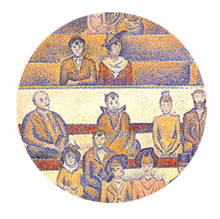
Now, instead of focusing on the acrobats, I have chosen to focus on the spectators. The spectators are sitting unnaturally upright. This is probably a conscious decision on the part of Seurat, to compensate for and balance the flamboyant actions of the acrobats. These still, upright shapes are balanced by almost perfectly horizontal lines. Seurat is known to be obsessed over science of art and composition!

By zooming in on this part of the painting and using a circular frame, it feels that the viewer is not just looking on at the scene, but rather peeping through a hole, and seeing the almost passive faces of the spectators who are not aware that they are being looked at and attracting such attention.

circus-circle-crop-25-resized.jpg

CROPPING 1

December 28, 2007

An image can be framed in various ways. By this, I mean the cropping of part of a larger image can affect the meaning and content of the painting as this changes the focus of the composition.
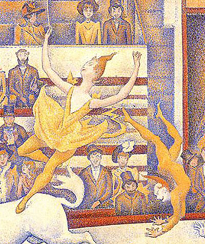
circus-crop-23-resize.jpg 

In this first frame, the focus is on the two acrobats, showing how their actions are related to each other at this moment of the act.

_______________________________________________________________
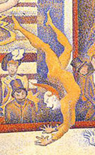
circus-crop-22-resized.jpg

By zooming in on the male acrobat, the focus is now on his posture, the agility of his body and his acrobatic act of flipping himself upwards. In this frame, because not much is shown of the ground, we can only get a clue that he is in mid-air because his hand does not cast any shadow on the ground.

_______________________________________________________________
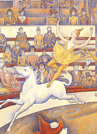
circus-crop-21-resized.jpg

Similarly, by cropping the main image again in this manner, the focus is now shifted to the gracefulness of the lady acrobat and her balancing act on the horse.
HUES AND SATURATIONS 3

December 23, 2007

circus-11-resize.jpg  

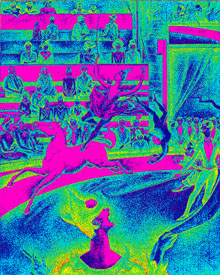
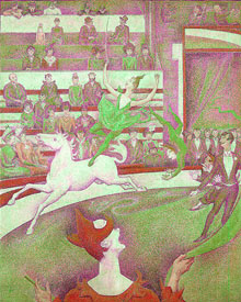
Still having fun with hue and saturation of the image. The highly contrasting colours of the image is shocking but the distribution of colours (done by the Adobe Photoshop programme, probably by detecting the intensity of colours in the original image), helps the viewer to understand how Seurat used elements of design – colours, lines, textures etc. to create balance in his work.

However, when looking at this image, rather than linking it to a masterpiece by Seurat, I am inclined to think of it as a draft or a sketch that is part of an exploration for a graphic image or poster.

HUES AND SATURATIONS 2

December 22, 2007

 circus-9-resized.jpg 

In this image, I continue to play with the hue and saturation of the image. The complementary and contrasting colours add excitement to the painting but again, the interpretation of mood and emotion is symbolic rather than realistic.