Archive for December, 2007

CROPPING 2

December 31, 2007

Having fun with all the Adobe Photoshop tools… 🙂

Just exploring the effects of using a circular frame instead of a rectangular frame… The circular frame brings the level of interest in the image another level. Because we commonly see images placed in a rectangular frame, images placed in a circular frame seem more interesting and refreshing. Besides, the circular frame fits this composition well because it complements Seurat’s intention of showing the relationship of the acrobats and the horse, caught in the middle of this skillful act.

  circus-circle-crop-24-resized.jpg

____________________________________________________________

Now, instead of focusing on the acrobats, I have chosen to focus on the spectators. The spectators are sitting unnaturally upright. This is probably a conscious decision on the part of Seurat, to compensate for and balance the flamboyant actions of the acrobats. These still, upright shapes are balanced by almost perfectly horizontal lines. Seurat is known to be obsessed over science of art and composition!

By zooming in on this part of the painting and using a circular frame, it feels that the viewer is not just looking on at the scene, but rather peeping through a hole, and seeing the almost passive faces of the spectators who are not aware that they are being looked at and attracting such attention.

circus-circle-crop-25-resized.jpg

CROPPING 1

December 28, 2007

An image can be framed in various ways. By this, I mean the cropping of part of a larger image can affect the meaning and content of the painting as this changes the focus of the composition.

circus-crop-23-resize.jpg 

In this first frame, the focus is on the two acrobats, showing how their actions are related to each other at this moment of the act.

_______________________________________________________________

circus-crop-22-resized.jpg

By zooming in on the male acrobat, the focus is now on his posture, the agility of his body and his acrobatic act of flipping himself upwards. In this frame, because not much is shown of the ground, we can only get a clue that he is in mid-air because his hand does not cast any shadow on the ground.

_______________________________________________________________

circus-crop-21-resized.jpg

Similarly, by cropping the main image again in this manner, the focus is now shifted to the gracefulness of the lady acrobat and her balancing act on the horse.

HUES AND SATURATIONS 3

December 23, 2007

circus-11-resize.jpg  

Still having fun with hue and saturation of the image. The highly contrasting colours of the image is shocking but the distribution of colours (done by the Adobe Photoshop programme, probably by detecting the intensity of colours in the original image), helps the viewer to understand how Seurat used elements of design – colours, lines, textures etc. to create balance in his work.

However, when looking at this image, rather than linking it to a masterpiece by Seurat, I am inclined to think of it as a draft or a sketch that is part of an exploration for a graphic image or poster.

HUES AND SATURATIONS 2

December 22, 2007

 circus-9-resized.jpg 

In this image, I continue to play with the hue and saturation of the image. The complementary and contrasting colours add excitement to the painting but again, the interpretation of mood and emotion is symbolic rather than realistic.


HUES AND SATURATIONS 1

December 21, 2007

The wonders of technology! By using the Adobe Photoshop software to manipulate the colours, saturations, contrast and balance, the effect of and response to the image is changed as shown in the four examples below…

circus-4-resized.jpg circus-5-resized.jpgcircus-8-resized.jpg circus-7-resized.jpg

Hues and saturations affect our emotional response. When the image no longer resembles the scene we expect to see in reality, with its natural colours and textures, we begin to interprete the image intuitively, associating colours with emotions and our experiences. The colour in the original image gives a warm glow to the painting. The whole atmosphere in the circus tent is bathed in warm yellow light. The feeling is warm, happy and pleasant. 

When the hue is changed, to red, for example, we no longer associate what we see to a realistic scene, but rather associate it with a particular mood. The ‘red’ image evokes a mood that danger is imminent, although at the present moment in the image, all seems well… The ‘blue’ image give off an air that something mysterious, strange and unnatural is happening.

The last two does not conjure up much excitement… In fact, it gives a feel of plainness and dullness (especially the ‘greenish-brown’ one).

Hue and saturation matters a lot to how a piece of work is read and interpreted!

Technologies determine form, meaning and effect

December 18, 2007

2043993639.jpg 3670814610.jpg 406323477.jpg4245045968.jpg 2987522236.jpg 2480962380.jpg 

4173648092.jpg 3553920767.jpg 3348747715.jpg 

All visual representations are made in one way or another, and the circumstances of their production may contribute to the effects they may have (Rose, 2002, p 17). Some writers (Berger, 1972) argues very strongly that the technologies used in making an image determine its form, meaning and effect.  

Indeed, in choosing an accurate picture to look at for this study, I was stumped at the variety and differences I saw in the internet. This picture, The Circus by Georges Seurat, came in all sorts of shades and tints and I was not quite sure which was closest to the original. Each can be interpreted differently and evokes a variety of moods – from bright and cheerful, warm, dull etc… Of course, some of these moods evoke are not quite coherent with intent of the painting.

We commonly expect to search for information through the internet and ‘information’ often conjures up the idea of ‘truth’. In reality, information through the internet are often opinions rather than truth and in my case, while looking for an accurate picture of The Circus for this project, I realised that the images in the internet are all individually moderated by a series of technological equipment and processes – the type of light, the lighting condition, the camera, the software that manipulated the photograph in the computer, the computer screen etc. I guess one can never be too sure of the exact shade and tint, unless of course if we are looking at THE ORIGINAL painting itself. Even so, how we individually perceive hues and shades may also vary.

Visual Analysis 2

December 14, 2007

circus-visual-analysis-2-resize.jpg

Seurat very cleverly used the elements of design to guide the viewer through his painting. 

As shown in the diagram above, the viewer’s eyes automatically rest on the lady acrobat. This is despite the fact that the ‘clown’ is right in the foreground and much bigger in size than the lady acrobat. Seurat is able to focus the viewer’s attention on the lady acrobat by contrasting the very symmetrical and stable posture of the clown with her very lively and flamboyant pose.

From the lady acrobat, the eye is guided to view the horse, the animated face of the clown, his ‘sash’, even out of the painting and back to the top of the doorway to rest on the crowd of spectators viewing the performance. All these are seen in a very graceful spiralling movement.

As the eye views the image through his intended manner, the viewer also takes in the fact that there are other performers involved in this performance, such as the other acrobat, the ringmaster as well as the musicians, playing a supporting role in the performance.

THE CIRCUS by Georges Seurat, 1891

December 11, 2007

The Circus

A little bit about Georges Seurat…

Georges Seurat was the founding member of the Divisionist technique, or Pointillism as it is more popularly known. Influenced by colour theorists, he took a scientific approach to emotion and harmony. He believed that a painter could use colour to create harmony and emotion in art in the same way that a musician uses variation in sound and tempo to create harmony in music. He said ‘Art is Harmony. Harmony is the analogy of the contrary and of similar elements of tone, of color and of line, considered according to their dominance and under the influence of light, in gay, calm or sad combinations’ (letter to Maurice Beaubourg, 1890).

In his exploration of colour combinations, Seurat opted for an accurate, pointillist method of mixing colours optically as opposed to doing so manually on the palette. Every dot is scientifically thought out before being executed on paper.

Seurat’s theories can be summarized as follows: The emotion of gaiety can be achieved by the domination of luminous hues, by the predominance of warm colors, and by the use of lines directed upward. Calm is achieved through an equivalence/balance of the use of the light and the dark, by the balance of warm and cold colors, and by lines that are horizontal. Sadness is achieved by using dark and cold colors and by lines pointing downwards.

Through this calm, calculated approach, Seurat revived order and contour to painting, which had somewhat been lost in the quest for Impressionism.

About THE CIRCUS…

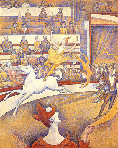
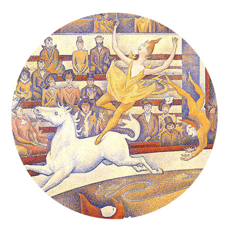
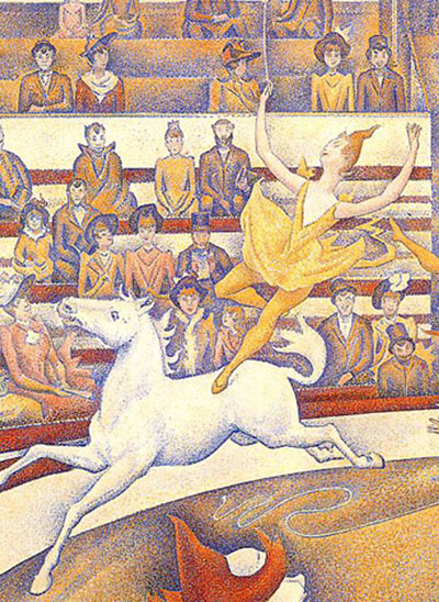
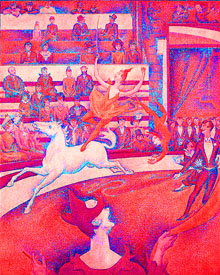
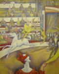
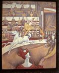
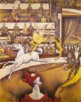
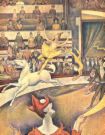
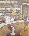
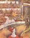
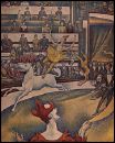
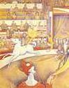
THE CIRCUS, is his last large-scale painting before he passed away unexpectedly at the age of 31. In fact, this painting remained unfinished at the point of his death.

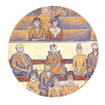
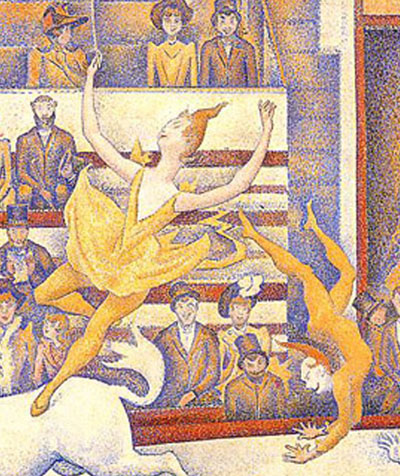
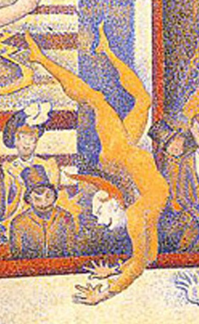
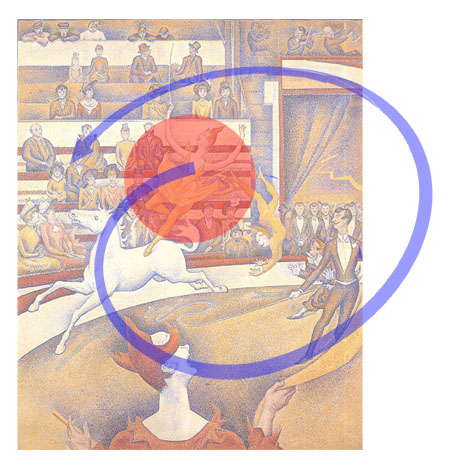
This painting, portrays a lively public entertainment at the Cirque Fernando. It depicts a moment in the performance, with the back of a clown, placed closest to the viewer. He seems to be part of the performance, together with four other performers: a lady acrobat, who is balancing on the back a white horse, another acrobat just slightly beside her, the ringmaster and another performer who is partly shielded by the ringmaster. The poses of the performers, some in midair, show that it is a lively performance, full of fun and action. They are performing within the confines of a circular stage, with rows of spectators encircling them. The spectators seem to come from two social classes – the well-groomed upper class closest to the action in the front seats, and the lower classes slouched at the back.

The composition in this painting is also dramatically different from all his other paintings. In contrast to his other works (e.g. Sunday Afternoon on the Island of La Grande Jatte, 1884 – 1886; Circus Sidewalk, 1887; El Baile Del Chahut) where his characters are rigid and still, because of his obsessive concern for pictorial order; in this painting, he used flamboyant, curvy lines to indicate lively activities and exhilirated excitement. These flamboyant and curvy lines are purposefully contrasted with strong horizontal lines of the spectator seats and the angular lines of the door way to create a balance. On the whole, the composition is depicted in an intellectual rather than responsive manner, with the intention to explore his theories about lines and colours. This composition also shows the influence of Jules Cheret, a poster-artist who often concentrated the action and drama of his compositions in the lines and space above the horizontal axis. In this case, similarly, most of the action occurs above the curved line of the wall demarcating the stage from the spectators.

By placing the group of performers in the foreground, clearly, the performers are the focus of this painting. The focus is accentuated by the clown – the fact that he appears to be right in front of the viewer, with his back facing the viewer and he holding something that looks like a ‘sash’ forming almost a curve that ends and points towards the acrobats and the horse. The spectators form the backdrop to this scene, while at the same time giving texture and adding interest to the whole painting.

Despite the lively movements of the performers, a surrealistic effect is created, partly from his use of the Divisionist technique and partly because he subtly reduced the characters and objects down to simple, one-dimensional planes and volumes. Tones are applied, on the whole, not so much from observation but for the purpose of demarcating one plane from another and one character from the next. This surrealistic effect suggests a sense of stillness, as if the characters are frozen in time; while the harmoniously warm interior, evokes a deep sense of calm in the viewer.

Studio Research Project

December 7, 2007

Select  an image that intrigues you. Conduct an in depth studio-based visual analysis of the image in which you will submit the image to the following processes:


– Visual Analysis
– Deconstruction
– Reconstruction
– Subversion
– Hybridization
– Transformation
– Interpretation


Consider how your studio-based interventions affect how the image can be read.