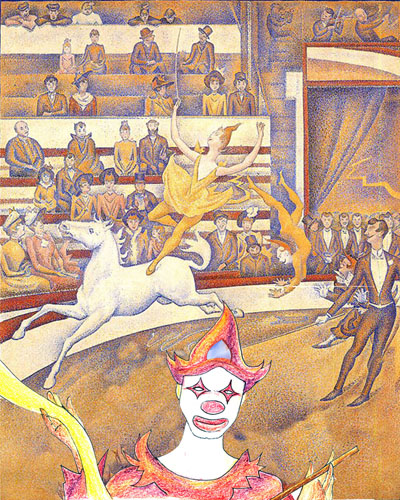
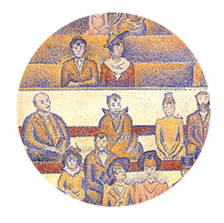
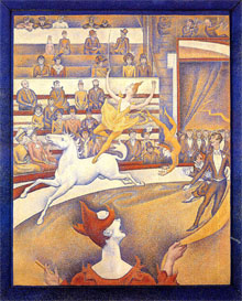
An image can be framed in various ways. By this, I mean the cropping of part of a larger image can affect the meaning and content of the painting as this changes the focus of the composition.
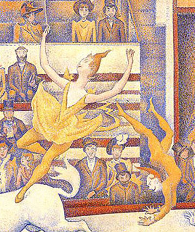
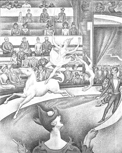
In this first frame, the focus is on the two acrobats, showing how their actions are related to each other at this moment of the act.
_______________________________________________________________
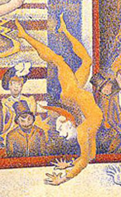
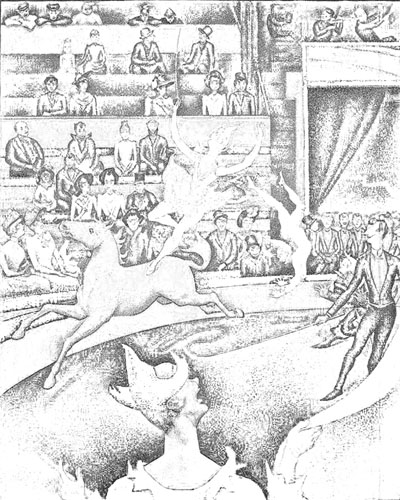
By zooming in on the male acrobat, the focus is now on his posture, the agility of his body and his acrobatic act of flipping himself upwards. In this frame, because not much is shown of the ground, we can only get a clue that he is in mid-air because his hand does not cast any shadow on the ground.
_______________________________________________________________
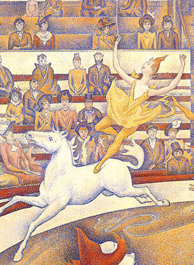
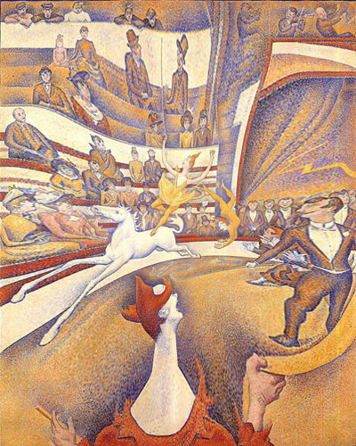
Similarly, by cropping the main image again in this manner, the focus is now shifted to the gracefulness of the lady acrobat and her balancing act on the horse.


 Just another thought…
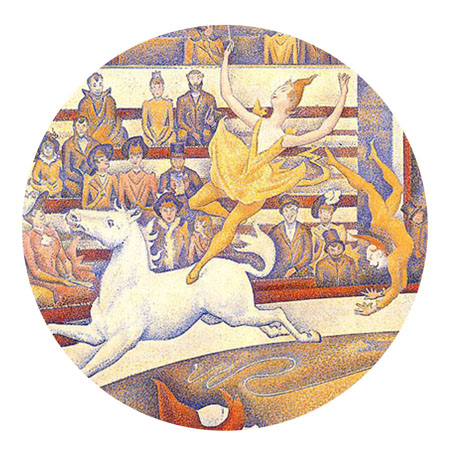
