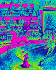
Still having fun with hue and saturation of the image. The highly contrasting colours of the image is shocking but the distribution of colours (done by the Adobe Photoshop programme, probably by detecting the intensity of colours in the original image), helps the viewer to understand how Seurat used elements of design – colours, lines, textures etc. to create balance in his work.
However, when looking at this image, rather than linking it to a masterpiece by Seurat, I am inclined to think of it as a draft or a sketch that is part of an exploration for a graphic image or poster.

Leave a comment