Archive for the ‘DECONSTRUCTION’ Category

LINES, LINES, LINES…

March 18, 2008

circus-glowing-edges-20-resize.jpg

In highlighting the edges of the characters and objects in the original image by giving it a glow against a dark background, the whole image is reduced to lines and outlines. Because of this, we start to become aware of the concentration and the quality of lines.

Characters in the foreground, in this case, the clown, the acrobats and the horse appear to have thicker and more definite lines. Incidentally, they are also the main characters in this whole image. The other characters and objects have a finer outline and tend to be more fuzzy, maybe because of the details that Seurat have included on them.

This is interesting because we often try to understand and analyse an image by looking at the shapes, sizes and colours, and less on the type and concentration of lines. Seurat, through his scientific precision in artmaking, besides being obsessed by the optical effects of colours, may also have had a systematic consideration for lines.

Hello, welcome to the circus…

March 14, 2008

clown-facing-front-resize.jpg

Instead of the clown’s back facing the viewer, in this image, the clown is facing and addressing the viewer. By doing so, it changes the position of the viewer, from one that is looking passively and uninvolved in the scene to one who is part of the scene as a spectator.

graphic design

March 7, 2008

deconstruction-resize.jpg

By cropping out the outline of the performers, I reconstructed the original image and rearranged the characters in a graphical rather than in a realistic manner. A visually literate viewer would almost automatically interpret this analogically rather than in a straightforward manner. This style can also be easily adapted to a poster or graphic design.

Crytallised!

January 29, 2008

circus-crystallised-resized.jpg

Crystallised! Achieved by applying another filter in Adobe Photoshop!

I find this image more fascinating than the previous ‘Mosaic Effect’. At first glance, I was all ready to trash this image because I couldn’t quite make out what it was. Then, I realised that as I narrow my eyes, a clearer image emerged! Unlike the ‘mosaic effect’, where I knew what to expect, I didn’t expect this image to have this effect at all!

Mosaic Effect

January 25, 2008

circus-mosaic-21-resized.jpg

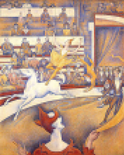
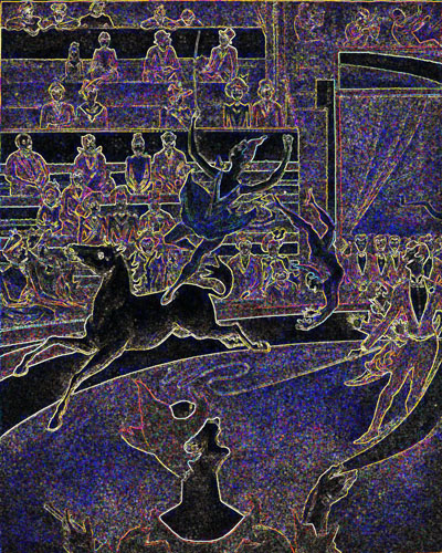
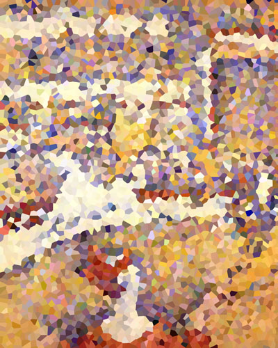
In this piece, I used Adobe Photoshop filters to create this mosaic effect. By so doing, the whole image is broken down to little squares… How does it affect the way the image it viewed?

circus-mosaic-cropped.jpg   circus-mosaic-cropped-zoom.jpg 

It depends on the size of each ‘mosaic’ in relation to the size of the whole image. If the size of each ‘mosaic’ is big and the overall size of the image is small, the image may be less legible from near. The image may only be visible when the viewer stands a distance from the image. With this effect, if viewed from a close range, some viewers may not even be aware of the meaning behind the image. As they move away from the image and start to view the work as a whole, they may start to realise that what they thought were mere squares of random colours actually form a coherent image. In viewing this image (with the moasic effect), the initial fascination with the image may not be with what this image is about but rather the process of how the image becomes clearer and reveals itself as one moves away from the image.

e08d3464-02.jpg   seurat-circus-detail-2-011.jpg 

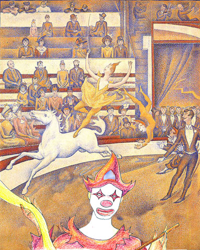
In a way, this image echoes Seurat’s Divisionist style because his original painting is composed of multi-coloured dots. A full appreciation of his work would be from a distance, as the dots would juxtapose and allow the viewer’s eyes to blend colours optically, rather than having the colours blend on the canvas or pre-blended as a material pigment.

This ‘mosaic’ effect of breaking down the whole picture into squares (pixels) makes the re-creation of this piece of work more possible for many people, in particular crafters, who are into cross-stitching and the likes. I must also mention, though, that I do enjoy cross-stitching and find it therapeutic but there not much creativity involved in the craft. May I be so bold as to suggest that Seurat may not have felt particularly creative while he was caught up with the laborious process of ‘dotting’ his large 185 cm x 150 cm masterpiece 😛 !

HUES AND SATURATIONS 3

December 23, 2007

circus-11-resize.jpg  

Still having fun with hue and saturation of the image. The highly contrasting colours of the image is shocking but the distribution of colours (done by the Adobe Photoshop programme, probably by detecting the intensity of colours in the original image), helps the viewer to understand how Seurat used elements of design – colours, lines, textures etc. to create balance in his work.

However, when looking at this image, rather than linking it to a masterpiece by Seurat, I am inclined to think of it as a draft or a sketch that is part of an exploration for a graphic image or poster.