REFLECTIONS

March 21, 2008

I approached this exercise with apprehension because I was not quite sure if I really understood what was expected and how to go about doing it… As I was planning and deciding on how to go about presenting this exercise, I realised that there are many ways to fulfill each category of effects and that ideas and thoughts may come sequentially as well as randomly. I decided that using the blog as a platform, may be the most suitable way. Besides, the blog as a platform allows comments from visitors (viewers) and what better way to gather feedback on ‘the effects the images would have on viewers‘ than this…

Hence, to see how the image has been put through the various effects, simply click on the effects listed under CATEGORIES on the right side of this page. I found it a challenge categorising the images as many of the images fell under a few categories and I soon realised that the choice of categories may really depend on individual perceptions. The best way to understand the whole journey that I have gone through, is to start with my very first entry which is right on the last page and move chronologically upwards…

I must admit that some of the effects are rather superficial and some are more interesting and in-depth. Please bear with me as I illustrate some of the more superficial effects because without going through some of these plain and rather commonsensical effects, I may not have arrived at the more interesting revelations. I must also put on record that these images are inexhaustive… Even as I am writing this post, there are other ideas that I have in mind, but do not have the time to work on…

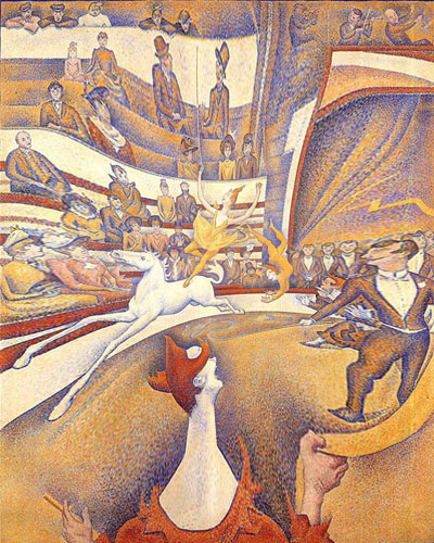
All in all, I have thoroughly enjoyed this assignment and wish that I have more time and resources to continue with this journey… I hope that as you view this blog, you can also contribute to this project by posting your comments on how your viewing of the THE CIRCUS by Georges Seurat is affected by the different effects that I have put the image through.

I hope that you enjoy will viewing this, just as I have enjoyed doing this… 🙂
LINES, LINES, LINES…

March 18, 2008

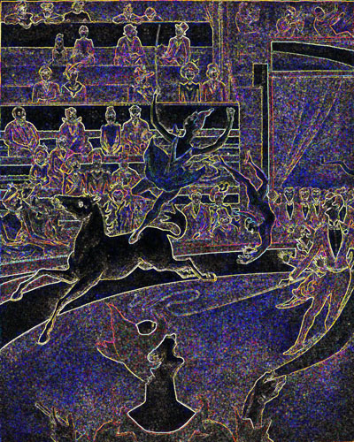
circus-glowing-edges-20-resize.jpg

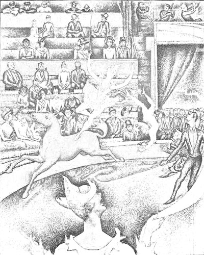
In highlighting the edges of the characters and objects in the original image by giving it a glow against a dark background, the whole image is reduced to lines and outlines. Because of this, we start to become aware of the concentration and the quality of lines.

Characters in the foreground, in this case, the clown, the acrobats and the horse appear to have thicker and more definite lines. Incidentally, they are also the main characters in this whole image. The other characters and objects have a finer outline and tend to be more fuzzy, maybe because of the details that Seurat have included on them.

This is interesting because we often try to understand and analyse an image by looking at the shapes, sizes and colours, and less on the type and concentration of lines. Seurat, through his scientific precision in artmaking, besides being obsessed by the optical effects of colours, may also have had a systematic consideration for lines.

Hello, welcome to the circus…

March 14, 2008

clown-facing-front-resize.jpg

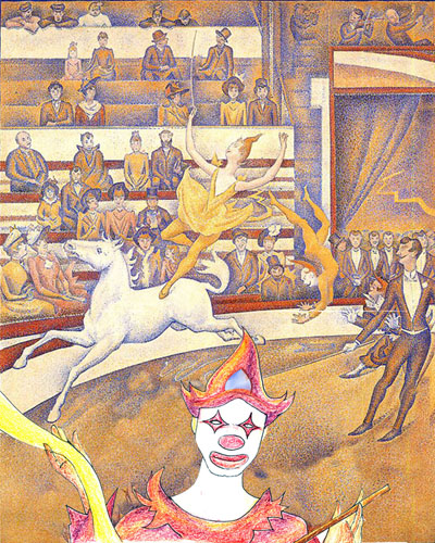
Instead of the clown’s back facing the viewer, in this image, the clown is facing and addressing the viewer. By doing so, it changes the position of the viewer, from one that is looking passively and uninvolved in the scene to one who is part of the scene as a spectator.

graphic design

March 7, 2008

deconstruction-resize.jpg

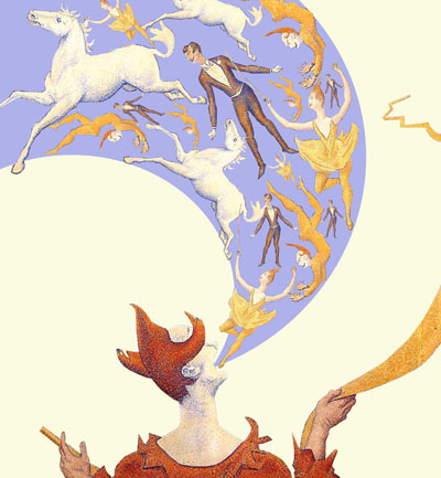
By cropping out the outline of the performers, I reconstructed the original image and rearranged the characters in a graphical rather than in a realistic manner. A visually literate viewer would almost automatically interpret this analogically rather than in a straightforward manner. This style can also be easily adapted to a poster or graphic design.

Looking at a negative print (almost)

February 29, 2008

circus-invert-16-resize.jpg

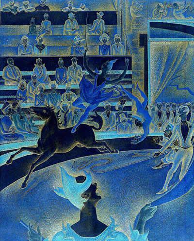
In this image, the tones are inverted… i.e. the light colours in the original image is now dark in this image and vice versa. It feels as if we are looking at a negative, but not quite because of its limited range of colours and tints.

Looking on at this image evokes a very cold, unreal and surrealistic feel.

Scanner vs Photocopier

February 22, 2008

circus-2-resize.jpg

circus-3-resize.jpg

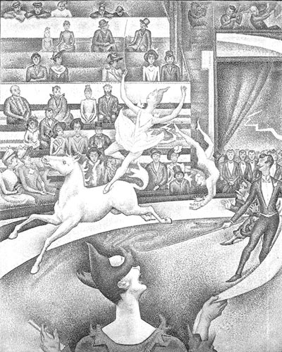
Indeed, the technology we use to create the final image affects how we view and value an image. The top image is scanned directly in grey tones and the bottom is created by photostating. There is a marked difference in the two images. All else being equal, if these two images are printed out on the same kind of paper, the ‘scanned’ one would look like it is of a better quality than the ‘photocopied’ one because the scanner is better able to discern tones than a photocopier.

Hence, the better quality print would be better valued than the photocopied print.

Hall of mirrors effect

February 18, 2008

circus-pinch-17-resize.jpg

Another special effect using the Adobe Photoshop filters… This time, the original image is ‘pinched’. In so doing, it creates a curious effect where the two acrobats remain the most proportional, and everything else around them are distorted and pulled towards the centre. Somehow, the distorted figures  (especially the clown with the elongated neck) seems to attract as much, if not more attention than the acrobats. It feels like we are looking at the image reflected from a distorted mirror.

Looking through a reflective sphere

February 15, 2008

circus-polar-coordinates-18-resize.jpg

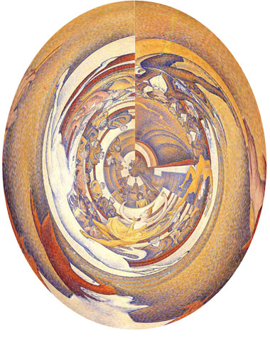
This image was created through a distortion (by applying the ‘change polar coordinate’s filter). It gives a somewhat similar impression of looking at the The Circus through a reflective spherical ball.

Through the distortion, it is still possible to make out certain main characters in the original image, if you know what you are looking for… but by and large, a viewer viewing this directly may have trouble figuring out the image that is being reflected in the ball… Hence, a viewer looking at this image, may be fascinated by the effect of this reflection on a concave surface rather than the masterpiece itself!

This form of distortion creates an optical illusion which is known scientifically as ‘Stereoscopic Vision’. Nigel Rodgers in ‘Incredible Optical Illusions’ explains, “Each eye gives us a slightly different view: the nearer the subject, the greater the difference. The brain combines the different views to give us ‘stereoscopic vision’ which enable us to judge shape, distance, depth, and dimension with ease.

REF:
Rodgers, N. (1997). Incredible Optical Illusions. Holland: Cordon Art.

Emboss Effect

February 8, 2008

circus-emboss-21-resized.jpg

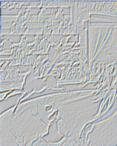
This image is 2 dimensional… but imagine if it is really embossed…

I am really not sure how another person would be affected by this image but personally, I as a viewer, will definitely keep and treasure this embossed image because I understand and appreciate this masterpiece by Seurat. And also because embossing is expensive and not quite commonly available as compared to printing, this embossed image would be pretty unique and rare!

a picture within a picture…

February 1, 2008

circus-reconstruction-1-resize.jpg

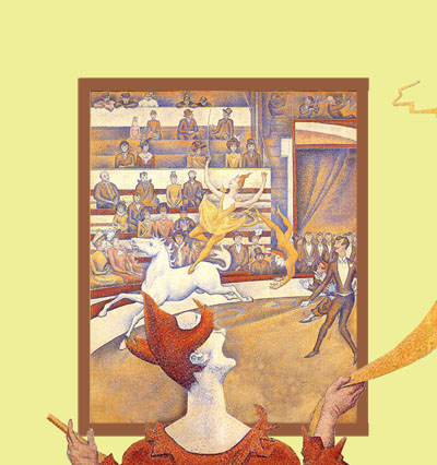
The image of the clown, which was in the foreground of the original reproduction, was ‘cut out’ and brought out of the picture frame. In so doing, another frame was created, and now, instead of the viewer, viewing the reproduction of The Circus, the viewer is now looking at the clown, who is viewing the reproduction of The Circus. In this sense, the focus has changed from the acrobats to the clown who is looking at the picture!